jakecharlton.design
Rokista
A lot of online marketplaces these days can feel overwhelming—filled with pop-ups, ads, and constant pressure to buy. Rokista set out to change that. Instead of using pushy marketing or flashy promotions, the focus is on creating a calm, user-friendly space where people can explore at their own pace.
Rokista
A lot of online marketplaces these days can feel overwhelming—filled with pop-ups, ads, and constant pressure to buy. Rokista set out to change that. Instead of using pushy marketing or flashy promotions, the focus is on creating a calm, user-friendly space where people can explore at their own pace.
Rokista
A lot of online marketplaces these days can feel overwhelming—filled with pop-ups, ads, and constant pressure to buy. Rokista set out to change that. Instead of using pushy marketing or flashy promotions, the focus is on creating a calm, user-friendly space where people can explore at their own pace.
Rokista
A lot of online marketplaces these days can feel overwhelming—filled with pop-ups, ads, and constant pressure to buy. Rokista set out to change that. Instead of using pushy marketing or flashy promotions, the focus is on creating a calm, user-friendly space where people can explore at their own pace.





01 // OVERVIEW
Here’s how it works: if a user is interested in a product, they simply tap to show it. That’s it. From there, it’s up to the business to start a conversation—no hard sell, just a direct, human interaction. This flips the typical experience on its head. Rather than chasing customers, Rokista lets the connection happen naturally, giving users more control and helping businesses engage with genuinely interested people.
01 // OVERVIEW
Here’s how it works: if a user is interested in a product, they simply tap to show it. That’s it. From there, it’s up to the business to start a conversation—no hard sell, just a direct, human interaction. This flips the typical experience on its head. Rather than chasing customers, Rokista lets the connection happen naturally, giving users more control and helping businesses engage with genuinely interested people.

02 // KEY CHALLENGES
Brand new start up.
The challenge
The client was fresh out of university and was looking for a very effective POC to potentially fund future rounds of investment and generate interest within the online space.
My solution
From the outset this project was never going to go into full production but this allowed us to flex our creative muscles by creating an engaging and interesting idea with no real limit to our designs.
02 // KEY CHALLENGES
Brand new start up.
The challenge
The client was fresh out of university and was looking for a very effective POC to potentially fund future rounds of investment and generate interest within the online space.
My solution
From the outset this project was never going to go into full production but this allowed us to flex our creative muscles by creating an engaging and interesting idea with no real limit to our designs.
Nothing but a name and a concept.
The challenge
Armed only with an idea the client was very open to use figuring out a lot of the detail of this project, it was very much a case of developing out the idea into a more concise and cohesive format that would be easier for any potential future users to understand.
My solution
Having very few restrictions when it comes to the creative aspect felt quite daunting but using a lot of self control and focus I was able to come up with a brand identity which reflected the nature and style of the business concept.
Nothing but a name and a concept.
The challenge
Armed only with an idea the client was very open to use figuring out a lot of the detail of this project, it was very much a case of developing out the idea into a more concise and cohesive format that would be easier for any potential future users to understand.
My solution
Having very few restrictions when it comes to the creative aspect felt quite daunting but using a lot of self control and focus I was able to come up with a brand identity which reflected the nature and style of the business concept.
Designing without distraction.
The challenge
Creating a clean, minimalist UI sounds simple—but it's actually quite tricky. Without flashy visuals or standard e-commerce patterns like “Add to Cart” or “Urgent Sale,” the risk is a UI that feels too empty or lacks guidance.
My solution
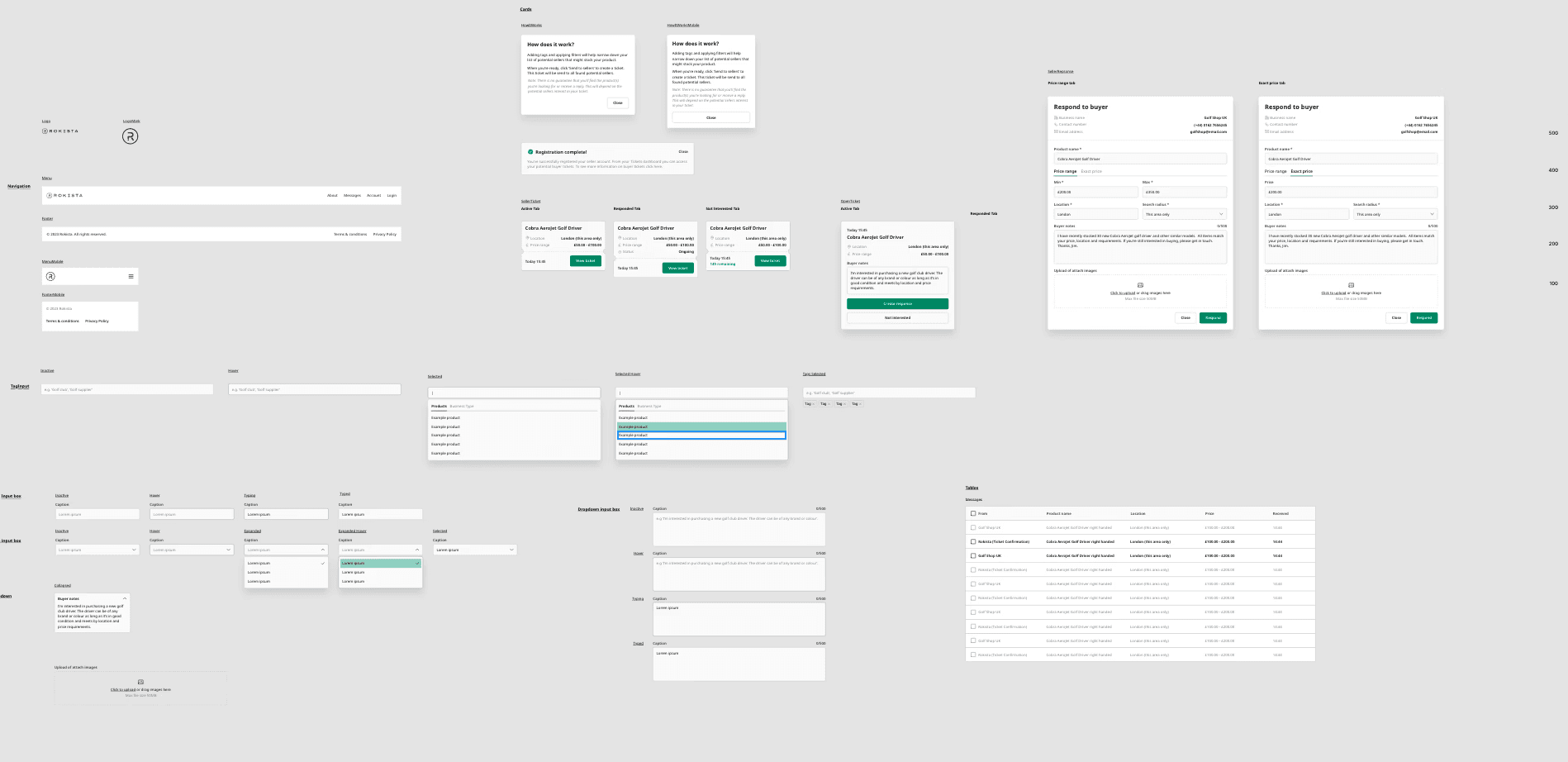
We used a carefully structured design system: whitespace was intentional, green tones guided focus, and friendly illustrations were added to balance minimalism with warmth. Typography hierarchy helped maintain clarity and rhythm across screens.
Designing without distraction.
The challenge
Creating a clean, minimalist UI sounds simple—but it's actually quite tricky. Without flashy visuals or standard e-commerce patterns like “Add to Cart” or “Urgent Sale,” the risk is a UI that feels too empty or lacks guidance.
My solution
We used a carefully structured design system: whitespace was intentional, green tones guided focus, and friendly illustrations were added to balance minimalism with warmth. Typography hierarchy helped maintain clarity and rhythm across screens.

03 // PROJECT BREAKDOWN
The devil is in the detail.
Overall identity
Starting from scratch with the idea around the brand we wanted to keep it as simple and as clean as possible. Staying away from complex messaging and confusing imagery we created a detailed yet concise design system which formed the backbone of the overall brand.
Typography
With the focus being a professional and tech focussed enterprise we just used Roboto Serif for the main titles and Noto Sans for the body copy. This gave the brand a nice balance of a human element with tech clarity.
Colour scheme
The majority of the website would be white with a range of green tones to denote various sections of information. These would allow the user to focus on finding the item they were designing with out all the distractions associated with traditional e-commerce web experiences.
Illustrations
Since the overall brand of the website would be extremely minimal and the client was very keen to not have basic stock photography until they were ready to develop the brand out further we introduced some quirky illustrations with the aim of having them balance off against the clinical aspects of functionality of the website.
03 // PROJECT BREAKDOWN
The devil is in the detail.
Overall identity
Starting from scratch with the idea around the brand we wanted to keep it as simple and as clean as possible. Staying away from complex messaging and confusing imagery we created a detailed yet concise design system which formed the backbone of the overall brand.
Typography
With the focus being a professional and tech focussed enterprise we just used Roboto Serif for the main titles and Noto Sans for the body copy. This gave the brand a nice balance of a human element with tech clarity.
Colour scheme
The majority of the website would be white with a range of green tones to denote various sections of information. These would allow the user to focus on finding the item they were designing with out all the distractions associated with traditional e-commerce web experiences.
Illustrations
Since the overall brand of the website would be extremely minimal and the client was very keen to not have basic stock photography until they were ready to develop the brand out further we introduced some quirky illustrations with the aim of having them balance off against the clinical aspects of functionality of the website.
04 // FINAL OUTCOME
Main website highlights
Landing page/home
Introduces Rokista’s calm, clutter-free marketplace experience with a clean layout, minimal text, and soft green accents on a white background.
Immediately communicates the brand’s key message: no pressure, no pushy ads—just simple, meaningful product discovery.
Features an engaging headline and a short set of quirky illustrations to quickly convey the “show interest, then connect” concept.
Designed to feel approachable and modern, helping users understand Rokista’s unique value proposition within seconds.
04 // FINAL OUTCOME
Main website highlights
Landing page/home
Introduces Rokista’s calm, clutter-free marketplace experience with a clean layout, minimal text, and soft green accents on a white background.
Immediately communicates the brand’s key message: no pressure, no pushy ads—just simple, meaningful product discovery.
Features an engaging headline and a short set of quirky illustrations to quickly convey the “show interest, then connect” concept.
Designed to feel approachable and modern, helping users understand Rokista’s unique value proposition within seconds.
04 // FINAL OUTCOME
Main website highlights
Landing page/home
Introduces Rokista’s calm, clutter-free marketplace experience with a clean layout, minimal text, and soft green accents on a white background.
Immediately communicates the brand’s key message: no pressure, no pushy ads—just simple, meaningful product discovery.
Features an engaging headline and a short set of quirky illustrations to quickly convey the “show interest, then connect” concept.
Designed to feel approachable and modern, helping users understand Rokista’s unique value proposition within seconds.

Home dashboard
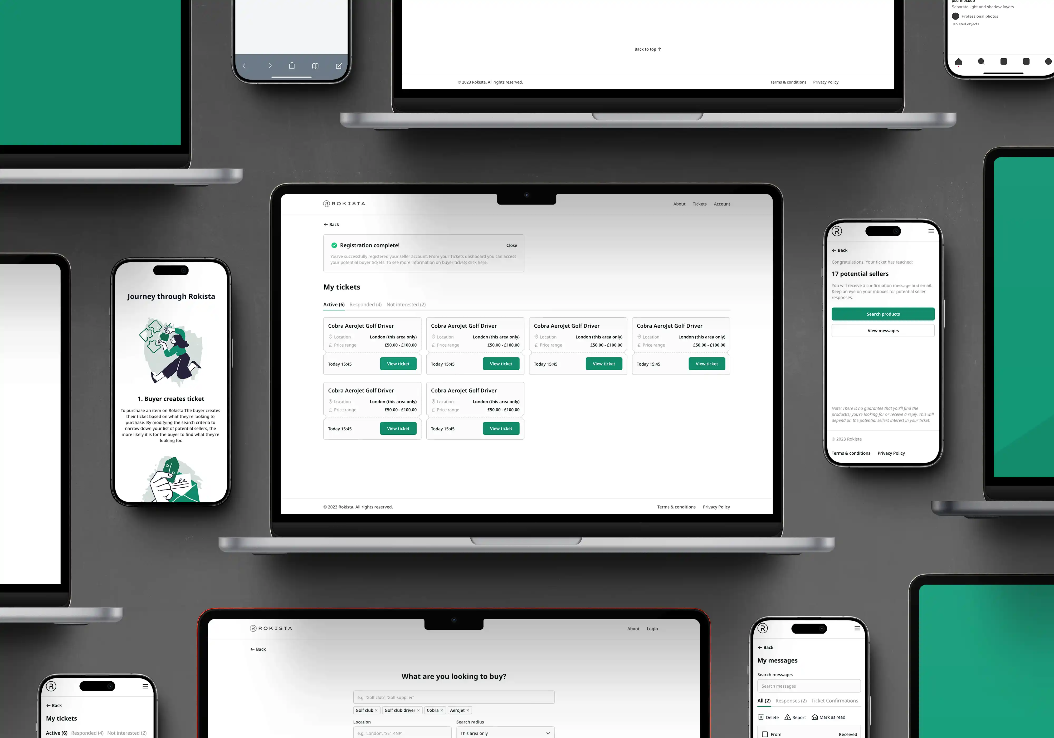
A centralised dashboard design feels very different to almost any other e-commerce experience you will find.
An uncluttered and clean space is the one of the main attractions of the design, you can locate all your tickets easily and cleanly.
With an emphasis on design led decision making the design system developed would scale very nicely with the digital product.
This design also translates extremely well into a mobile specific setting, ensuring it performs like a top level mobile app.
Home dashboard
A centralised dashboard design feels very different to almost any other e-commerce experience you will find.
An uncluttered and clean space is the one of the main attractions of the design, you can locate all your tickets easily and cleanly.
With an emphasis on design led decision making the design system developed would scale very nicely with the digital product.
This design also translates extremely well into a mobile specific setting, ensuring it performs like a top level mobile app.
Home dashboard
A centralised dashboard design feels very different to almost any other e-commerce experience you will find.
An uncluttered and clean space is the one of the main attractions of the design, you can locate all your tickets easily and cleanly.
With an emphasis on design led decision making the design system developed would scale very nicely with the digital product.
This design also translates extremely well into a mobile specific setting, ensuring it performs like a top level mobile app.
Conversation starter page
Offers a highly minimal, distraction-free browsing experience with clearly segmented product cards and ample white space.
Users can simply “tap to show interest” on products—no cart, no checkout, no complex navigation.
Uses green tones to subtly guide the eye and highlight interaction points (like the “I’m interested” button).
Balances clean functionality with moments of character through thoughtful, slightly quirky illustrations that make the experience feel friendly but refined.
Conversation starter page
Offers a highly minimal, distraction-free browsing experience with clearly segmented product cards and ample white space.
Users can simply “tap to show interest” on products—no cart, no checkout, no complex navigation.
Uses green tones to subtly guide the eye and highlight interaction points (like the “I’m interested” button).
Balances clean functionality with moments of character through thoughtful, slightly quirky illustrations that make the experience feel friendly but refined.
Conversation starter page
Offers a highly minimal, distraction-free browsing experience with clearly segmented product cards and ample white space.
Users can simply “tap to show interest” on products—no cart, no checkout, no complex navigation.
Uses green tones to subtly guide the eye and highlight interaction points (like the “I’m interested” button).
Balances clean functionality with moments of character through thoughtful, slightly quirky illustrations that make the experience feel friendly but refined.
From custom branding to high-speed websites, I build the foundation you need to connect with your audience and scale your vision.
From custom branding to high-speed websites, I build the foundation you need to connect with your audience and scale your vision.
From custom branding to high-speed websites, I build the foundation you need to connect with your audience and scale your vision.
HERE TO HELP
Got any design related questions on your mind?
Not every project needs a full scoping call right away. If you’re floating an idea, checking timeline availability, or just want to chat through a quick question drop me a line here.
hello@jakecharlton.design
HERE TO HELP
Got any design related question on your mind?
Not every project needs a full scoping call right away. If you’re floating an idea, checking timeline availability, or just want to chat through a quick question drop me a line here.
hello@jakecharlton.design
HERE TO HELP
Got any design related question on your mind?
Not every project needs a full scoping call right away. If you’re floating an idea, checking timeline availability, or just want to chat through a quick question drop me a line here.
hello@jakecharlton.design
Resources (Coming soon)
Free brand check list
Newsletter sign up
Creator tools
Resources (Coming soon)
Free brand check list
Newsletter sign up
Creator tools
Resources (Coming soon)
Free brand check list
Newsletter sign up
Creator tools